The graph below shows average carbon dioxide (CO2) emissions per person in the United Kingdom, Sweden, Italy and Portugal between 1967 and 2007. Summarize the information by selecting and reporting the main features and make comparisons where relevant.
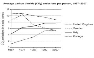
The line graph depicts the average carbon dioxide emissions of each person in four different countries over 40 years, starting from 1967.
Overall, carbon dioxide emitted by individuals in the U K and Sweden dropped significantly, whereas a substantial increase was observed in Italy and Portugal.
As per the graph, it can be seen that carbon dioxide emissions per person in the U K was the highest throughout the four decades despite a steady decline from 11 to 9 metric tonnes. Similarly, the average carbon dioxide emissions in Sweden were almost the same as that of the U K. In 1967, it was followed by a reduction to around 4 metric tonnes. Then it went down gradually to 5 metric tonnes by 2007.
In contrast, in both Italy and Portugal, carbon dioxide released by people rose rapidly over the time. To be specific, Portugal’s carbon dioxide emissions nearly quadrupled, starting at just above 1.5 metric tonnes in 1967 to 5.5 metric tonnes by the end of the period, matching Sweden’s average. However, it doubled in Italy compared to the initial year and remained steady at around 8 metric tonnes.